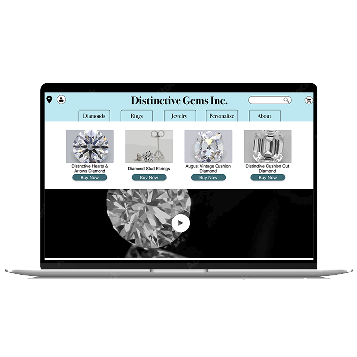
Cultivating Brilliance: A Gem of a Website Redesign for Distinctive Gems Inc.
Tools
Figma
Pen / Paper
Zoom
Discipline
UX Research
Interaction Design
Information Architecture
Visual Design
Team
Joel Ives - Sole UX Designer
Timeline
October 2nd - October 18th
Upon first glance, the website violated numerous heuristics. While much of the site’s content was usable, the delivery of that content needed a refresh.
The Goal
To validate whether my initial assumptions about the website were correct and if so, to clean up the site map and delivery of the content to encourage users to delve deeper into what Distinctive Gems Inc. offered as a business.
Process Overview
Business Research
Understanding what the company's goals were and what they were trying to convey was important. Understanding the brand name competitors that it was up against was a crucial first step to identify where this redesign could go.
Usability Testing
Verifying my assumptions was key to understanding if the website’s heuristic violations did in fact negatively impact the user experience.
Synthesis
I needed to carefully assess what my users said and how they interacted with the website to have a better idea of how the information on the site could be better arranged.
Ideation / Solution
Building off of the company’s existing brand guidelines was key, so sketching and wireframes would be the answer to creating a functioning high fidelity solution.
Research Overview
Heuristic Violation #1
Consistency and Standards
It was hard to know even where to begin purchasing diamonds and settings due to too many confusing navigation options.
Heuristic Violation #2
Flexibility and Efficiency of Use
There is no obvious way to create an account or sign in to access the companies additional benefits, like creating a registry.
Heuristic Violation #3
Consistency and Standards
There was no clear cut direction on how to go about looking for bands and rings again due to the high number of options and their confusing terminology.
Usability Testing
I broke my usability test questions into 2 parts. The first two questions asked to find a specific product, and the next 2 prompted the users to find a product of their choosing in a specific category.
Interestingly, 3 out of 5 users immediately chose to use the search bar to find the specific products I asked for in the first two questions. All 3 of those users struggled greatly when having to search through the website’s categories. The 2 users that did not use the search bar to find the specific products struggled at first, but were much more comfortable with the latter 2 questions.
Journey Map
By creating a journey map of my user’s experience during one of my usability test prompts, I was better able to understand their experience during the challenge, taking note of their frustrations and eventual response to achieving the goal.
Competitive Analysis
A competitive analysis of larger, competing brands was conducted to see what features Distinctive Gems Inc. either lacked or had over the competition. This analysis revealed that while the Distinctive Gems Inc. website did account for the majority of features it’s competitors also had, the location of these features on the website was to blame for its lack of clarity.
Synthesis
After conducting an open and closed card sorting activity with my users, it became much more evident that there was a much simpler rhetoric and way to organize the site’s information.
The results from my usability tests encouraged me to keep the search bar for when users want to find specific products, but to build a much cleaner top navigation bar that wouldn’t discourage users from navigating the site that way.
Ideation
The first issue I wanted to tackle was the sitemap of the website. Through testing, the number of options at each level of the website were too great. Above to the right is the old site map, and beneath that is the sitemap I created, which shows how much more simple the sitemap could be.
The wireframes I created ensured that I was staying consistent with the brand’s overall appeal, but cleaned up the architecture and information delivery by using the verbiage I validated from my card sorting activities.
A mid-fidelity prototype was the next step to ensuring that I was not violating many, if any, of the heuristics I evaluated at the beginning of this project.
Solution
The high-fidelity prototype I created is the culmination of the research I conducted. It maintains many good content pieces that the website already had, but ultimately improves the user experience by highlighting recognition rather than recall, and creating a friendly atmosphere that encourages the user to dive deeper into the site.
Shortcomings
Due to the time constraints of the project, I was unable to conduct any further usability testing on the high-fidelity prototype. This means that my solution is not validated which is a fundamental flaw in UX design. If I had just 1 more day to work on this project, I would have conducted that testing, which means that my task prioritization was ever so slightly off. That is a mistake that I will not make again moving forward because I understand the importance of validating solutions.
Disclaimer
This project was conducted through General Assembly as part of the UXDI Immersive course I paid to enroll in. I had no contact with Distinctive Gems Inc. and they are unaware that this solution has been created. 


